Click to view our Accessibility Statement


FREE UK Standard Delivery for orders of £50 or over


Using Derwent Lightfast on Derwent Mixed Toned Paper to Create a Portrait by Jake Spicer


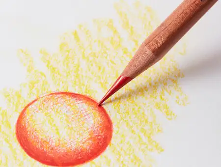
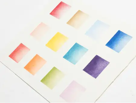
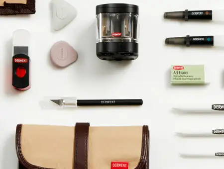
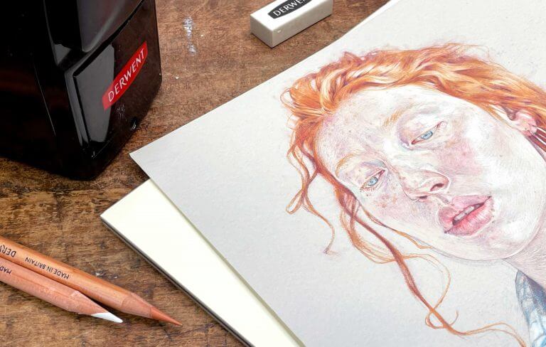
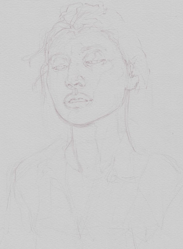
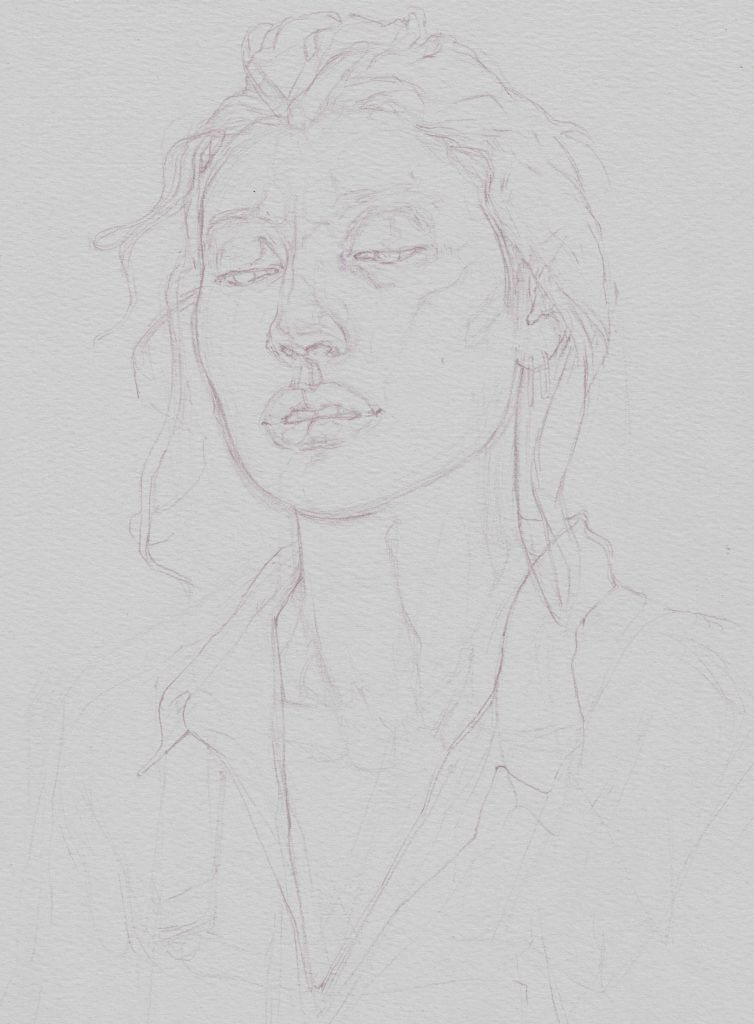
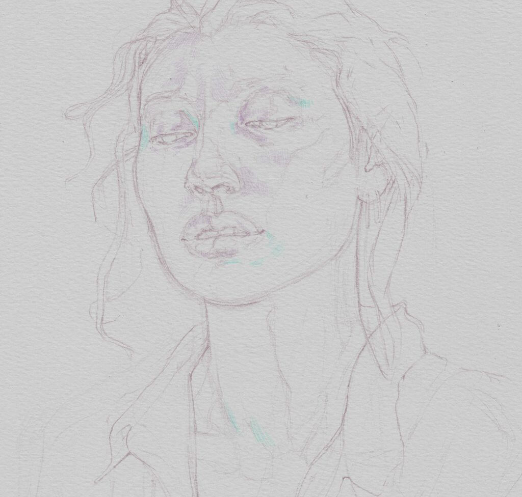
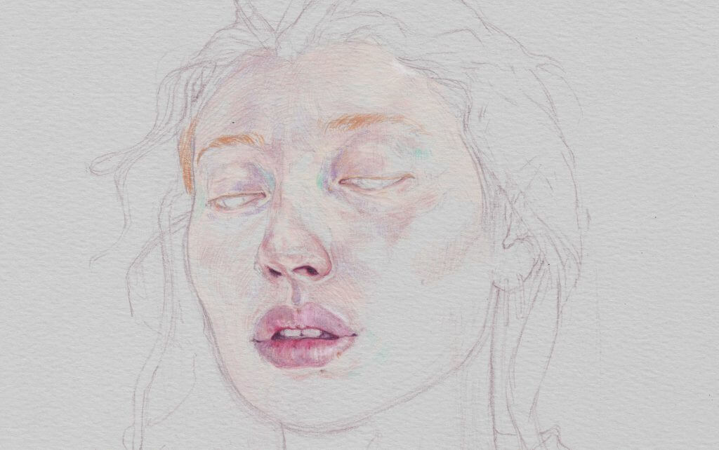
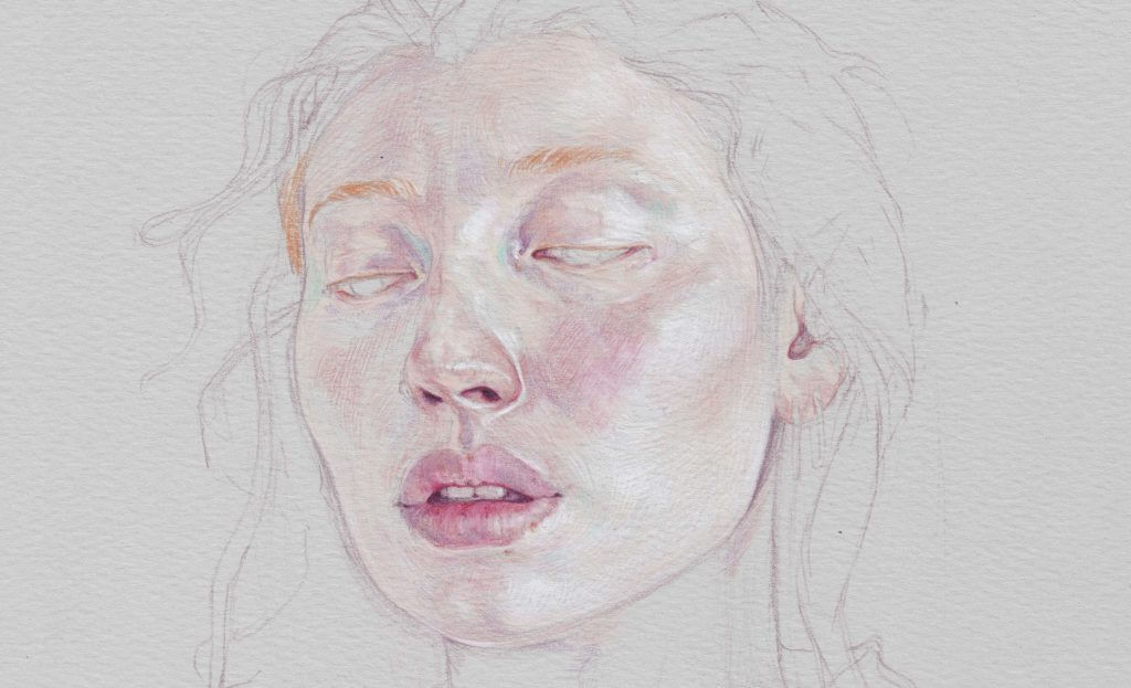
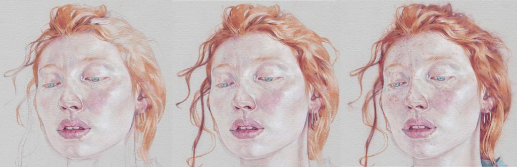
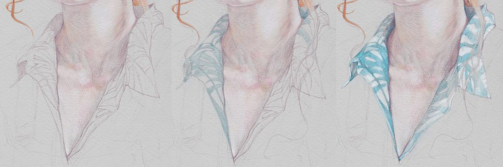
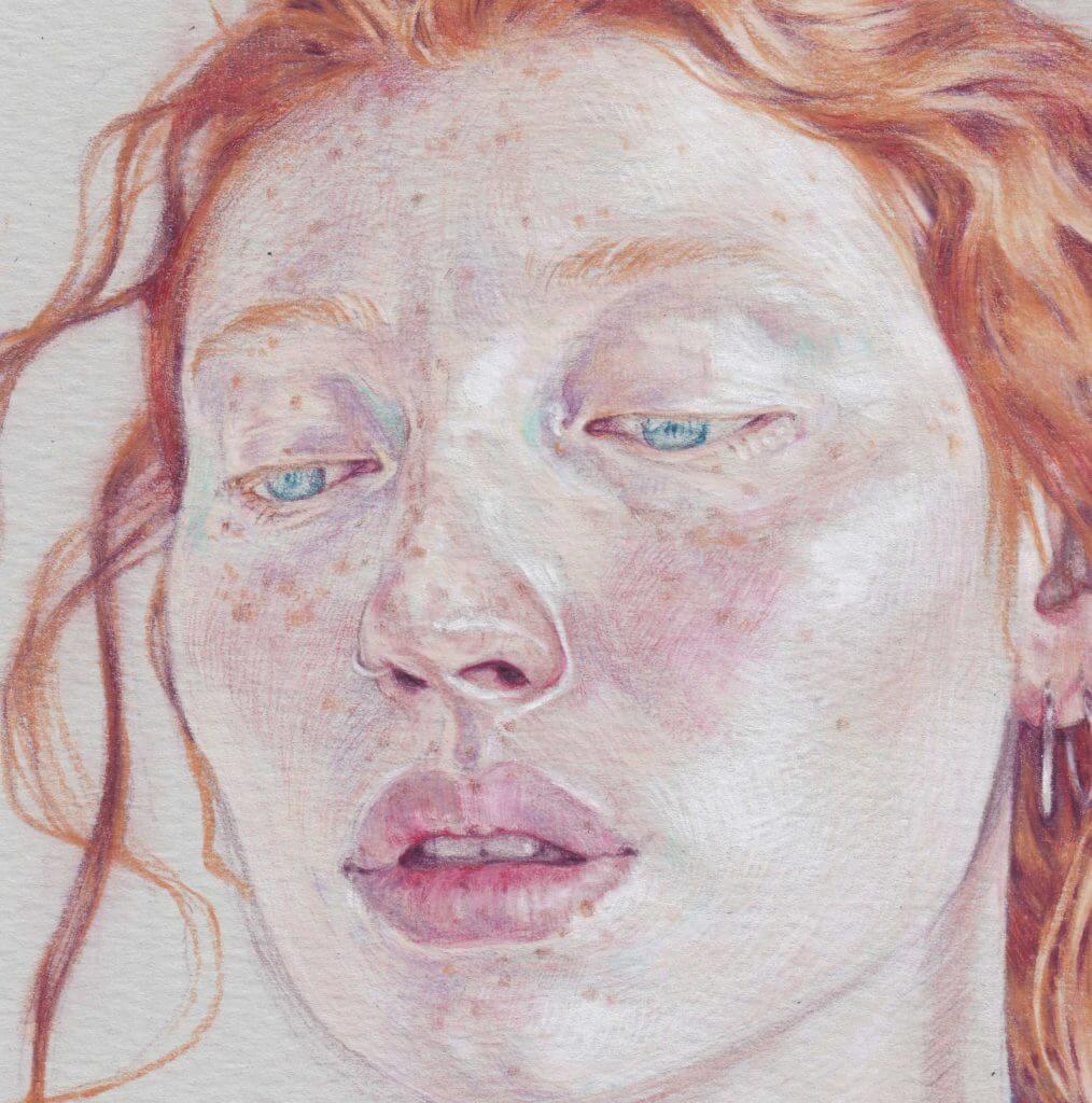
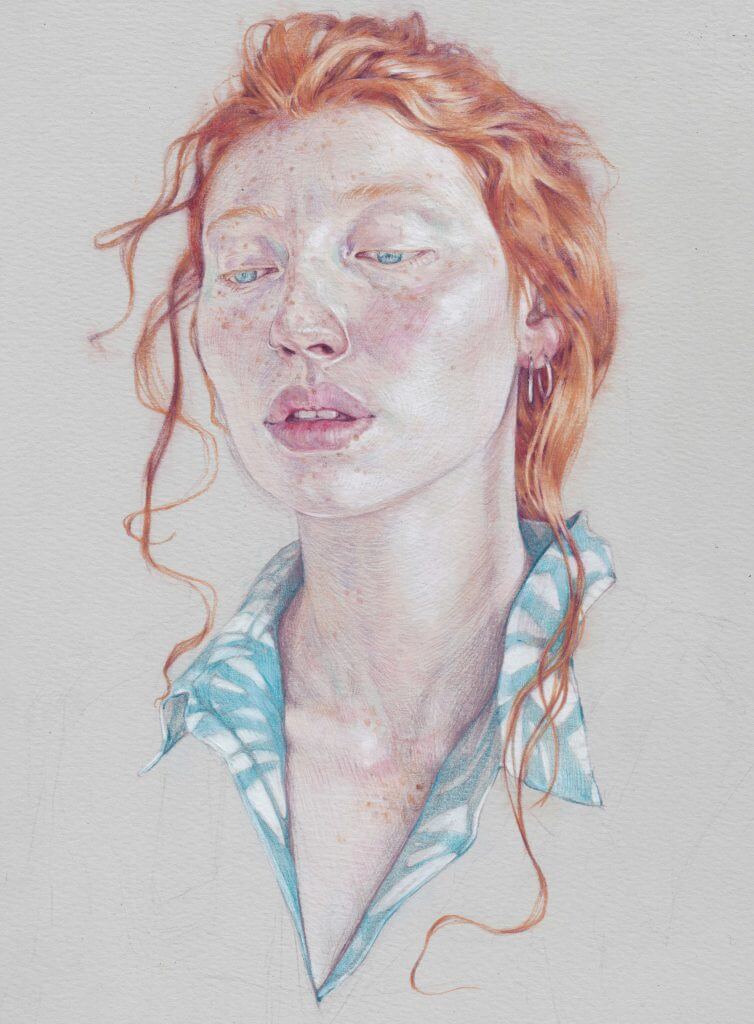
Most of the world we see is a midtone – the darkest darks of our blackest pencils marks and the bright white of bleached paper are rare occurrences in the visual world. Prior to the 20th Century few artists drew on paper as white as the surfaces we have become familiar with and most historical work were made on off-white papers as varied as the local manufacturers that produced them. I’m a great fan of a good midtone paper, so I was delighted when Derwent invited me to make some drawings on their new papers. The A4 and A5 pads are strong, lightweight midtone papers in a variety of tones, with dual smooth and textured sides. In this tutorial I’ll take you through a portrait of Immie that I drew in Derwent Lightfast colour pencil on the smooth side of the light grey paper from the pad.


Stage 1: Rough Underdrawing


Working from a photograph I made the loose establishing drawing in Lightfast Taupe – a warm midtone coloured pencil that would be easily covered by the later layers. I always hold the pencil with an underhand grip for these drawings to allow for lighter, more energetic marks.

Colour: Taupe


Stage 2: Tonal map

Building upon the rough underdrawings I loosely delineating a map of the most important shapes of tone and colour in the face. Although this is one of the least impactful stages of the drawing it is also the most important, laying the foundations for everything that will follow.

Colour: Taupe


Stage 3: Light cools

It is easy to overlook the cool colours of the face, so I like to establish them early – picking out the subtle turquoise and lavender hues in the skin before moving on to the warmer details. The relative cool of the grey paper, compared to the warmth of skin, will happily stand in for many of the light shadows of the face.

Colours: Wild Lavender, Turquoise Green


Stage 4: Features

At this stage colour comes to the face! Making marks in the directions of the surface of skin and using my earlier tonal map for guidance I started to fill in shapes of warm colour on the skin, leaving plenty of the light grey paper showing through. This included the dark of the nostrils, the rims of the eyelids and the shadows that sit between the lips and teeth. Ultimately I will work out from the features to cover all of the skin in a similar patchwork of coloured shapes.

Colours: Pale Peach, Salmon, Derwent Red, Deep Rose, Oyster, Burnt Siena


Stage 5: Highlights

At this stage the midtone paper really comes into its own – using the same directional marks that I used in the previous stage I built up broad areas of subtle light on the cheek and temple, and sharp edges of concentrated highlights around the features. These highlights not only emphasise the form of the head but create strong contrasts with the warm darks of the features, drawing attention to the expressive elements of Immie’s face.

Colour: White

Eyes with Lightfast pencils

Stage 6: Eyes

Despite establishing the shapes of the irises of the eye and surrounding negative spaces of the whites early in the drawing I prefer to elaborate upon the detail of the eye later than the other features to avoid them staring back at me as I draw. I used White and Dark turquoise to both pick out the colour of the iris and contrast with the reds and oranges of Immie’s skin and hair.
Colours: Dark Turquoise, White


Stage 7: Hair

The hair straddles several stages of drawing – I established its shape early in the portrait, but returned to the bands of orange colouring much later, using colours that would again appear in the freckles of the face. I tried to work as faithfully as possible from my references, avoiding the temptation to draw individual hairs. Once the shirt was drawn I added further whisps of hair over the collar and darkened the hair as it receded away around the back of the head.

Colours: Venetian Red, Champagne, Deep Rose, Burnt Siena


Stage 8: Shirt

The pattern on the shirt mirrors the botanical commission that I also produced alongside this drawing of Immie – a plant from the glass houses at Kew Gardens first sketched on a trip some years ago. Starting with the shapes in Taupe I filled in the shapes of tone and colour, echoing the colour palette I’d used in the eyes.

Colours: Taupe, Dark Turquoise, White


Stage 9: Freckles

I find it easiest to add freckles at a later stage once the balance of tone and colour in the skin has already been established. Adding them need not be slow, but they should be drawn with a delicate hand, with attention paid to how dark or pale their appear in relation to the surrounding skin. A single freckle might vary in tone as it crosses the boundary of a shadow, like the dash of pigmentation that borders Immie’s lip – a drawing that includes freckles must be sensitive to these changes.

Colour: Burnt Siena


Stage 10: Finishing balance

Stepping back from the drawing I always find it important to make a final appraisal of the whole before deciding it is complete. I made a few final adjustments in a variety of colours, bring an eraser in to lighten or clean up a few areas before stepping away and declaring it finished.

Colours: All of the above

Thank you to Jake Spicer for providing this tutorial. You can discover his work on his website or Instagram.

Find out more about the Derwent Lightfast pencil range here.
Find the right paper for your artwork here.


Learn more about how to use Lightfast pencils for portrait drawing